Sharpening high resolution CaK images
Posted: Mon Oct 01, 2018 10:10 pm
Today I found time to process some CaK videos from September 19th. Seeing was quite good, but the sky was a little hazy, transparency not really good.
Working on these images I was, again, struggling with the question how much sharpening is appropriate if the aim is to depict the structures of the chromosphere as accurate as possible (neglecting, at least for the moment, any asthetic qualities of the images).
I finally came up with two versions:
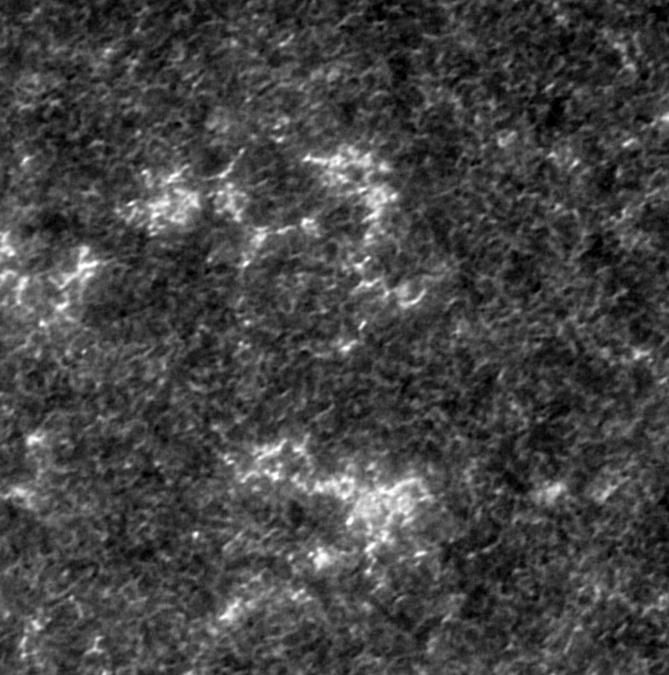

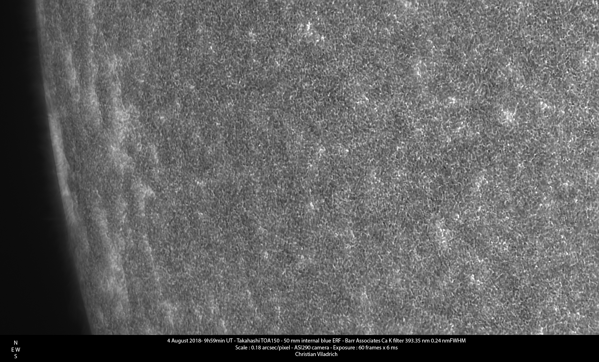
The first one looks quite soft and blurry, so I applied more sharpening to get the second one. This one looks a little more crisp when scaled down to 75 percent:
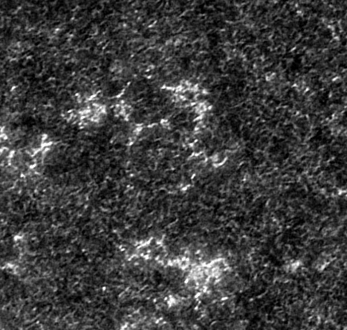
From the pictures posted in this forum (and the replies and comments here: viewtopic.php?f=4&t=24905) it seems to me that most people prefer more sharpened, crisp images (see e.g. the marvelous images here: viewtopic.php?f=4&t=24887, viewtopic.php?f=4&t=24940, viewtopic.php?f=4&t=25055).
If I take the images of the Dutch Open Telescope (operated at the Spanish Observatorio del Roque de los Muchachos of the Instituto de Astrofísica de Canarias, http://www.staff.science.uu.nl/~rutte10 ... _home.html) as a standard, however, it seems to me that the first, blurry version of my picture is the one that comes closer to depicting the solar structures shown on the DOT images. Scaled down to compare them with the images above these look like this:
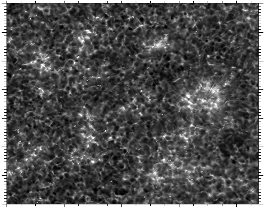
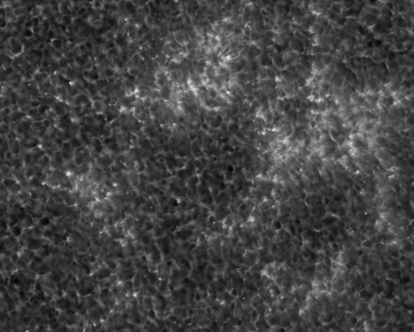
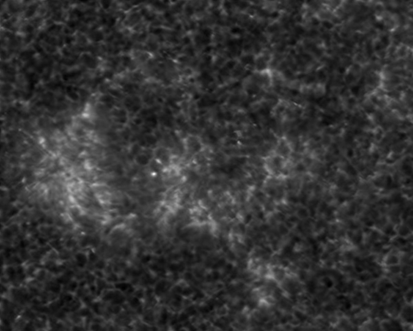
My point is that, if the DOT pictures are reliable, then there are REAL soft, blurry structures to be seen in professional CaK images, which may be captured at least in part with our amateurs‘ high res equipment. These structures may be lost if our images are sharpened with the aim of getting a crisp look.
Now clearly a lot of unsharpness in my first image above is caused by imperfect conditions (hazy sky, quite high gain and therefore a quite large stack etc.) but comparing it to the (scaled down) DOT image I think it still might begin to capture some of the real blurred structures: In particular I think there are similarities in the light grey stuctures, their shape, variations of brightness, the variations of their density etc.
So it seems to me that the first version of my image is clearly unsharp (for the usual reasons) and surely could be improved upon, but it is an unsharp image of a soft, blurry structure, so sharpening it further to get something like the second version would remove some real structure from the picture, so to speak.
As always, comments and critique welcome!
Frank
Working on these images I was, again, struggling with the question how much sharpening is appropriate if the aim is to depict the structures of the chromosphere as accurate as possible (neglecting, at least for the moment, any asthetic qualities of the images).
I finally came up with two versions:
The first one looks quite soft and blurry, so I applied more sharpening to get the second one. This one looks a little more crisp when scaled down to 75 percent:
From the pictures posted in this forum (and the replies and comments here: viewtopic.php?f=4&t=24905) it seems to me that most people prefer more sharpened, crisp images (see e.g. the marvelous images here: viewtopic.php?f=4&t=24887, viewtopic.php?f=4&t=24940, viewtopic.php?f=4&t=25055).
If I take the images of the Dutch Open Telescope (operated at the Spanish Observatorio del Roque de los Muchachos of the Instituto de Astrofísica de Canarias, http://www.staff.science.uu.nl/~rutte10 ... _home.html) as a standard, however, it seems to me that the first, blurry version of my picture is the one that comes closer to depicting the solar structures shown on the DOT images. Scaled down to compare them with the images above these look like this:
My point is that, if the DOT pictures are reliable, then there are REAL soft, blurry structures to be seen in professional CaK images, which may be captured at least in part with our amateurs‘ high res equipment. These structures may be lost if our images are sharpened with the aim of getting a crisp look.
Now clearly a lot of unsharpness in my first image above is caused by imperfect conditions (hazy sky, quite high gain and therefore a quite large stack etc.) but comparing it to the (scaled down) DOT image I think it still might begin to capture some of the real blurred structures: In particular I think there are similarities in the light grey stuctures, their shape, variations of brightness, the variations of their density etc.
So it seems to me that the first version of my image is clearly unsharp (for the usual reasons) and surely could be improved upon, but it is an unsharp image of a soft, blurry structure, so sharpening it further to get something like the second version would remove some real structure from the picture, so to speak.
As always, comments and critique welcome!
Frank